Think about the last time you used your phone. Did you tap something quickly? Or maybe, just maybe, did you press and hold on something to see what would happen? If you did — congratulations! You just used one of the oldest tricks in mobile UX: the long press.
The long press (also called “press and hold”) has been with us for years. It might seem simple, but there’s a lot of thought behind it. Let’s dig into why this little gesture refuses to go away and how it keeps making our mobile lives better.
What Is “Long Press” Anyway?
A long press is exactly what it sounds like — you press down on your screen and hold your finger there for a second or two. And voila! Something extra happens. It’s like unlocking a hidden menu or opening a magical drawer of options.
We don’t always notice it, but long press is everywhere. On iPhones, Androids, tablets, and even some smartwatches, the long press helps users do things faster and discover hidden features.
Here’s what makes it so special:
- It saves space on the screen
- It reduces taps and clutter
- It lets apps add power-user features
A Brief Trip Down Memory Lane
Long presses have been around since the early days of touchscreens. Back then, we didn’t have fancy gestures or tons of buttons. Designers had to be clever. So, they came up with this idea: what if a longer touch did something different?
It worked. Over time, the long press became a quiet hero of mobile interaction.
Today, it powers tiny but useful features like:
- Previewing emails or links
- Rearranging app icons
- Opening shortcut menus
- Selecting multiple photos
You might not think about these moments — but they’re all thanks to the long press.
Why It Keeps Hanging On
With so many modern gestures (swipes, pinches, double-taps), you might wonder why we still need the long press. Great question! Here’s why it’s still going strong:
1. It Feels Natural
Sometimes, you tap and nothing happens. But if you press and hold, suddenly a menu appears. It almost feels like a secret handshake between you and your app. That sensation of “Aha! Something extra!” feels good — like discovering a hidden level in a game.
2. It’s a Space Saver
Screens are small. Long press lets designers hide extra options without cluttering up your view. Instead of showing five buttons, they can show one — and pack the other four behind a long press.
3. It Speaks to Super Users
The long press is often used for “power features.” Stuff not every user needs, but stuff the pros want. For example: sharing directly to a favorite contact or seeing quick info about a file. By hiding those features under a long press, the design stays clean but still powerful.
But Wait… Isn’t Long Press Confusing?
Yes… sometimes.
One downside of the long press is that not everyone knows it’s there. New users might not think to try it. There’s no big red arrow saying “hold this for magic!”
That’s the trade-off — fewer buttons but more hidden content. When done poorly, long press can confuse. But when done well? It delights.
Creators Are Getting Smarter
To solve those issues, designers now use smart clues to make long press more discoverable. These include:
- Haptic feedback: your device vibrates softly to say “yep, you nailed it”
- Visual hints: tiny popups or highlighted items that appear while holding
- Teaching moments: apps showcase long-press tips during onboarding
These improvements make it easier for users to stumble upon long press — and actually understand it.
Who’s Still Using Long Press?
Practically everyone!
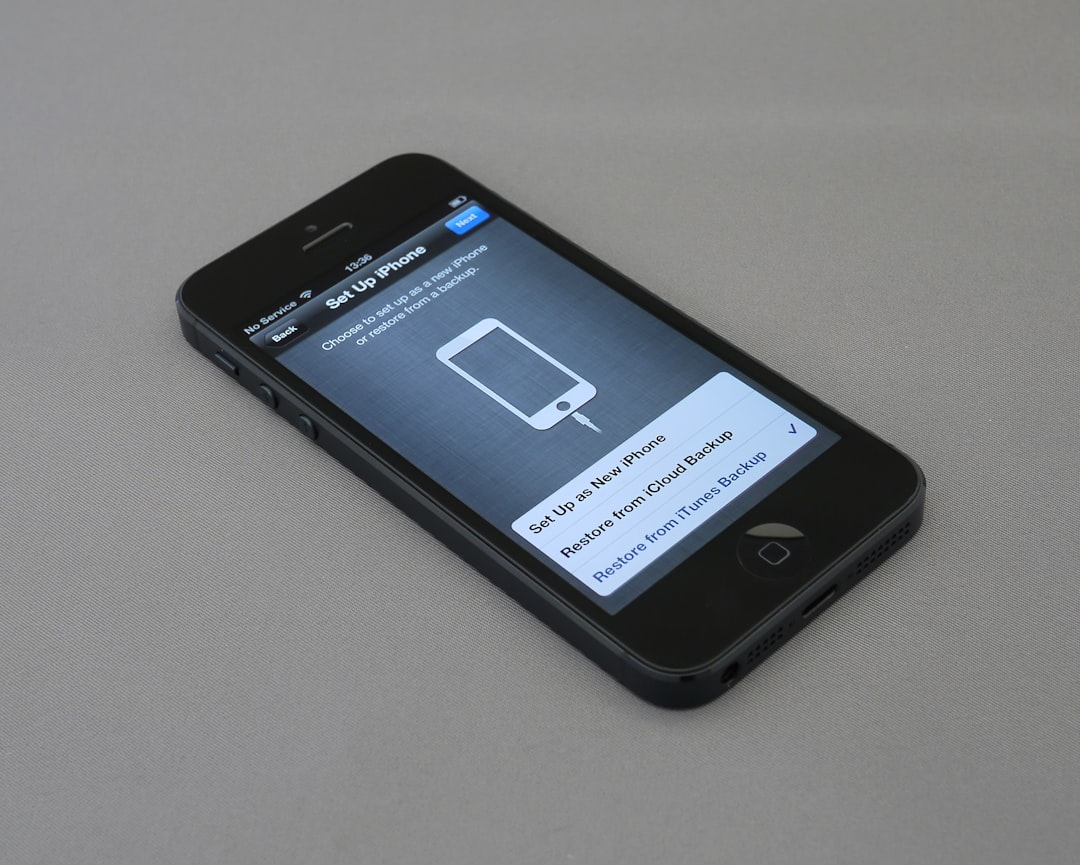
Apple uses long press all over iOS. Press and hold an app icon and you’ll get fast actions like “Share” or “Remove.” On Safari, press and hold a link to preview it.
Android has deep ties to long press. You can use it to add widgets, rearrange icons, or even access clipboard options while typing.
Google Maps lets you drop a pin by long-pressing anywhere on the map.
Instagram lets you preview photos with a long press in the explore section.
WhatsApp lets you select multiple messages or chats by long pressing.
Even games use it — sometimes to charge up power or unlock special moves.
Little Press, Big Power
Part of what makes long press so lovable is how much it can do without you thinking about it. One second, your thumb is chilling. The next, you’re doing something cool, like:
- Pinning a chat to the top
- Downloading a file fast
- Jumping between open tabs
In just one gesture, you shave off taps, save time, and feel like a mobile wizard.
It’s Not Just for Phones
Long press even goes beyond phones now. Tablets, smartwatches, and even some smart TVs are using the long hold in intuitive ways.
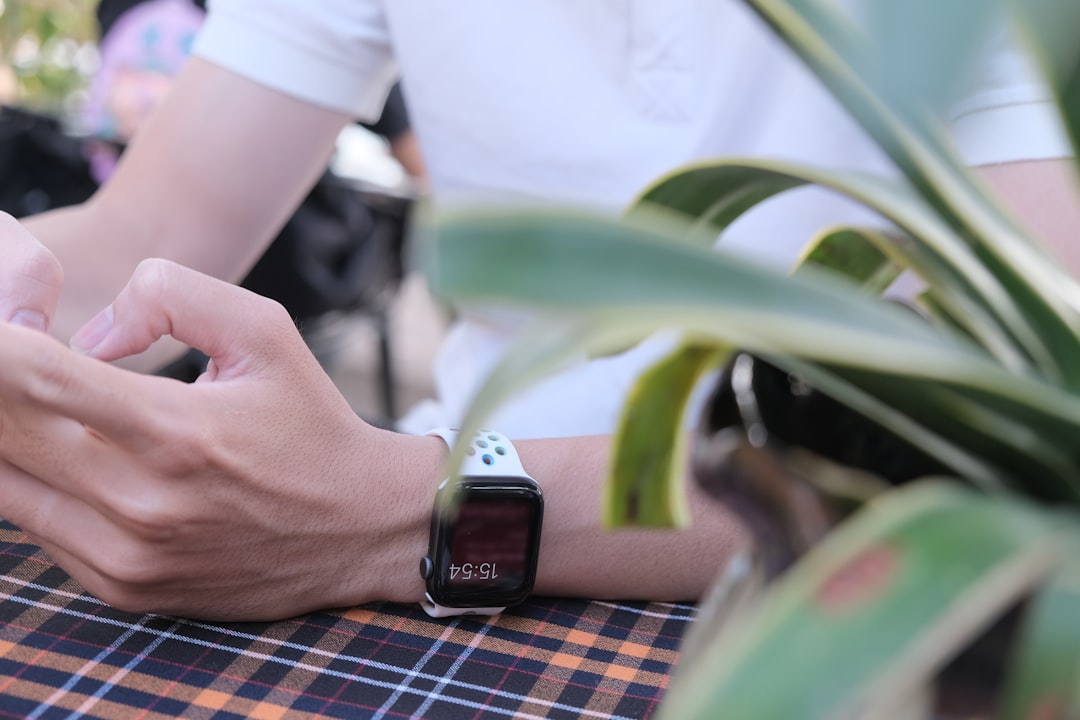
For example, on Apple Watch, a long press (called “Force Touch” in the past) was used to change watch faces. On Android Wear, holding can activate certain apps or bring up menus.
So, while screens may be tiny — or sometimes oddly shaped — long press still finds a way to fit in.
What’s Next for Long Press?
As tech evolves, so do gestures. But the long press isn’t disappearing — it’s evolving too.
- Some phones now combine long press with force sensitivity (remember “3D Touch”?), adding another layer.
- Long press is also being mixed with other gestures, like dragging or swiping once held.
- Apps are getting better at teaching users about hidden gestures, including long press.
Designers are even exploring context-aware long press — where what happens depends on where and when you press. That means more power with fewer clicks.
The Secret Hero of UX
It’s easy to overlook the long press. It doesn’t make a big deal out of itself. It’s not flashy. Not loud. But in the world of mobile UX, it’s survived for nearly two decades for a reason.
It’s clever. It’s useful. And when used just right, it makes your phone feel like it reads your mind.
So next time you’re using your favorite app, go ahead. Press and hold. Who knows what amazing little feature is waiting to pop up?
Comments are closed.