
It is also superfluous to talk about the popularity of websites nowadays because we are all aware of that. As the number of devices and types of devices with an Internet connection increases, so does the number of different sizes displayed by a website.
Of course, satisfying all these sizes and showing the site as it should look in every possible size is a great challenge, but if it turns out, then everything invested in realizing it pays off many times over. The two main groups into which all website sizes can be divided are desktop and mobile.
Websites must adapt to desktop sizes so that written and unwritten rules find it, which also applies to mobile sizes. For a website to succeed, it’s also crucial to have the best hosting provider. What we love about WPMU DEV Hosting most is it’s packed with unique and powerful hosting features you won’t find anywhere else (like 7 built-in PRO WP plugins). See for yourself and get 20% off any of their hosting plans here.

The importance of mobile-friendly websites is reflected in the fact that today more people search on their smartphones than on desktops, which is why Google ranks sites, among other things, based on this parameter. Therefore, there are two ways to customize your website for both groups: Responsive Design and Adaptive Design.
Responsive design works on the principle that the site adapts to the device’s screen size on which it is open. On the other hand, the adaptive design is more like two separate websites, one adapted to mobile devices and the other to desktop devices.
Each of the ways has its advantages and disadvantages; it is up to you to decide what best suits you and your needs at a given time. Below we bring you two of many tools available to compare your website on the desktop and mobile.
1. Mobile / Desktop Code Differences Analysis Tool
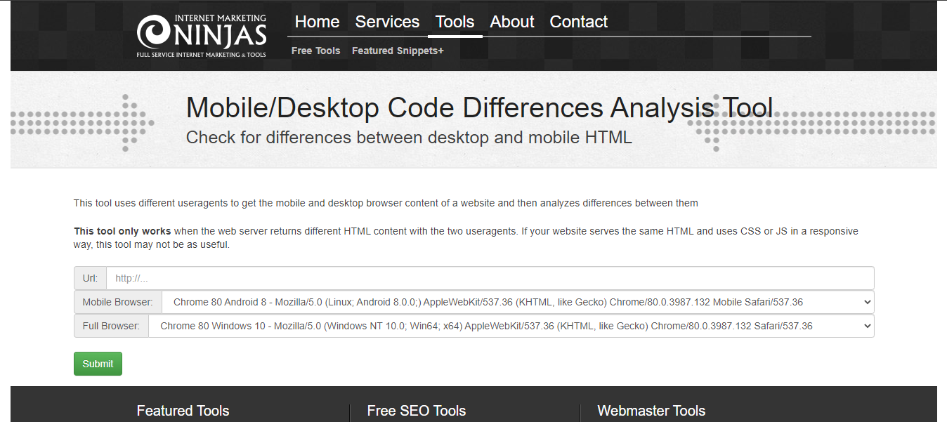
The first on the list of tools we will mention in this context is the Mobile / Desktop Code Differences Analysis Tool. This tool only works in one case, when the webserver returns different HTML content for the mobile and desktop versions of the website. To be a little more precise, this tool only works for sites developed using the Adaptive design we mentioned in the introduction part of this text.
What does this tool do? After entering the link of your website and selecting the settings for mobile and desktop, the tool gives you the differences in code for mobile and desktop versions of your website’s code due to its analysis. In addition to just the content, it provides you with information for both platforms: Content-Length, Link Count, Unique Link Count, Linked Words Count, Non-Linked Words Count, etc.
2. BrowserStack Responsive
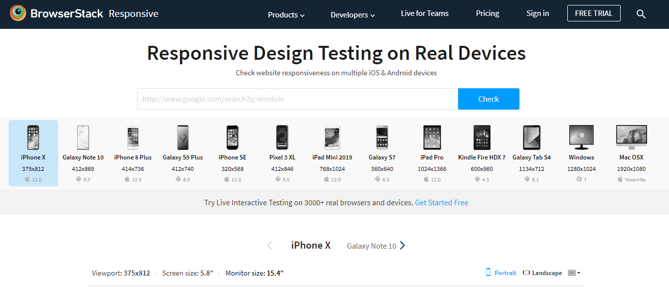
BrowserStack Responsive is one of the tools offered by BrowserStack. This tool allows you to test the look and feel of your website in a variety of sizes on both mobile and desktop platforms. In addition to various device sizes, you can test your website on Android, iOS, Windows, and macOS platforms. Another excellent functionality of BrowserStack Responsive is displaying a website in portrait and landscape mode.
All you have to do is go to the official website of this tool, create a free account. After that, enter the link to your website in the field provided and click “Check.” In a few moments, your website will be loaded on all available devices, which allows you to view the website on each of these devices in more detail.
Conclusion
If you want to be competitive with your website in today’s market that knows no boundaries, then you need to take care that your site looks flawless on any platform and any screen size.
With the help of the above-described tools, you can very easily and quickly detect any flaws in your site. After that, all you have to do is eliminate the shortcoming and make your site the favorite place for your target group.
Comments are closed.