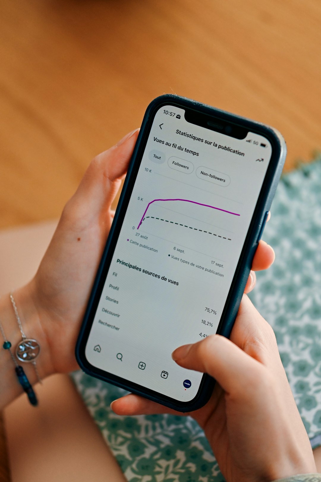
Understanding how users interact with your app is no longer a luxury—it is a necessity. In a crowded digital landscape where attention spans are short and competition is fierce, knowing what captures attention, what gets ignored, and where users disengage can make or break your product. This is where app heatmap analytics software becomes an indispensable tool for teams that want to optimize user experience through real, visual data.
TLDR: App heatmap analytics software visually represents user behavior through color-coded data overlays that show where users tap, scroll, and spend the most time. It helps teams identify friction points, improve conversions, and refine UX design with precision. By translating complex behavioral data into intuitive visuals, heatmaps make optimization faster and more effective. Businesses that use heatmaps can make smarter, data-backed decisions that directly impact performance and revenue.
At its core, heatmap analytics transforms abstract data into something instantly understandable. Rather than combing through spreadsheets of click counts or session durations, teams can see exactly how users behave on screens within seconds.
What Is App Heatmap Analytics Software?
App heatmap analytics software is a tool that visually displays user interaction data using color gradients. Warmer colors like red and orange typically indicate high engagement, while cooler colors like blue and green show lower interaction levels.
Depending on the platform, heatmaps can display:
- Tap heatmaps – where users tap or click most frequently
- Scroll heatmaps – how far users scroll through screens
- Gesture heatmaps – swipes, pinches, and other touch interactions
- Attention heatmaps – areas where users spend the most time
Instead of guessing why a feature underperforms, teams can visually pinpoint whether users never see a button, hesitate before checking out, or drop off midway through a form.
Why Visualizing User Behavior Matters
Traditional analytics tools present numerical metrics such as bounce rates and session durations. While useful, these numbers often fail to explain why users behave the way they do. Heatmaps bridge this gap.
Visual data offers several advantages:
- Instant clarity – Patterns become visible without deep analysis.
- Faster decision-making – Teams can quickly identify and prioritize issues.
- Cross-team alignment – Designers, developers, and marketers interpret the same visual evidence.
- Reduced assumptions – Design decisions rely on real user behavior instead of opinions.
For example, if users consistently tap on a non-clickable image, the heatmap will reveal this behavior instantly. That insight might suggest an opportunity to turn the image into an interactive element or clarify its function.
Key Features of Modern Heatmap Analytics Software
Today’s app heatmap tools are far more advanced than simple click trackers. They often integrate with broader analytics ecosystems and provide layered insights.
Important features include:
- Real-time data tracking for immediate behavioral insights
- Segmentation filtering by device type, location, user cohort, or session source
- Integration with session recordings to replay actual user journeys
- Funnel analysis overlays that connect interaction data to conversion paths
- A/B testing compatibility for comparing different design versions
These features allow businesses not only to see what users are doing but also to explore deeper behavioral narratives behind those actions.
Types of Heatmaps and Their Use Cases
Different heatmaps answer different questions. Understanding how each type functions helps teams extract more precise insights.
1. Tap Heatmaps
Tap heatmaps reveal the most frequently clicked or tapped areas within the app interface. They are especially valuable for:
- Evaluating call-to-action (CTA) buttons
- Optimizing navigation menus
- Detecting misplaced interactive elements
- Identifying rage taps (rapid repeated taps)
If a critical feature receives minimal engagement, teams can reconsider its placement, visibility, or labeling.
2. Scroll Heatmaps
Scroll heatmaps show how far users scroll before dropping off. These are crucial for content-heavy screens.
They help answer questions such as:
- Do users see the pricing section?
- Are important messages buried too low?
- Where does user interest decline?
3. Gesture Heatmaps
In mobile apps, gestures matter. Swipes, pinches, and long presses often define navigation. Gesture heatmaps help refine mobile user experience by visualizing how users interact beyond simple taps.
Benefits for Product and UX Teams
App heatmap analytics software significantly enhances the workflow of product managers, UI designers, and growth teams.
Improved User Experience:
By identifying confusion points, teams can simplify navigation and reduce friction.
Increased Conversions:
Knowing where users hesitate in checkout flows allows for targeted optimization.
Higher Retention Rates:
Understanding engagement patterns makes it possible to refine onboarding sequences and keep users coming back.
Data-Driven Iteration:
Features can be improved incrementally based on concrete behavioral evidence.
For instance, during onboarding, heatmaps might show users skipping important tutorial prompts. Adjusting placement or design can dramatically improve activation metrics.
Heatmaps and Conversion Optimization
Conversion rate optimization (CRO) is one of the most impactful applications of heatmap analytics. Every tap or scroll provides valuable clues about intent.
Heatmaps can uncover:
- Hidden friction in checkout forms
- CTA buttons below user attention zones
- Distracting elements pulling focus from key actions
- Misleading layout patterns
By comparing before-and-after heatmaps following a design update, teams can validate whether changes lead to improved engagement. This reduces reliance on guesswork and strengthens business confidence in UX decisions.
How Heatmaps Complement Other Analytics
Heatmaps are most powerful when combined with other data sources. Quantitative analytics may tell you that 60% of users abandon a process, but heatmaps help explain why.
Pairing heatmaps with:
- Session recordings reveals individual behavioral journeys.
- Funnels clarifies at which exact step users disengage.
- User feedback tools adds qualitative context to visual data.
- Performance metrics connects slow load times to reduced engagement.
This layered approach creates a holistic understanding of the user experience.
Challenges and Limitations
While powerful, heatmap analytics software is not without limitations.
Common challenges include:
- Misinterpretation of data – High tap counts do not always indicate positive engagement.
- Sampling bias – Insufficient data can distort patterns.
- Privacy considerations – Data must be collected responsibly and in compliance with regulations.
- Over-reliance on visuals – Visual data should be supported by context and testing.
For example, a red hotspot near a form field might represent confusion rather than interest. Teams must analyze patterns carefully rather than making assumptions.
Best Practices for Using Heatmap Analytics
To maximize the value of heatmap data, consider these best practices:
- Define clear objectives before analyzing data.
- Segment users to identify behavioral differences across groups.
- Combine quantitative and qualitative data for complete context.
- Test hypotheses with controlled experiments rather than acting on a single dataset.
- Review data regularly to stay aligned with evolving user behavior.
A structured approach ensures that insights translate into meaningful improvements rather than superficial design tweaks.

The Future of App Heatmap Analytics
The future of heatmap analytics lies in artificial intelligence and predictive modeling. As AI-driven analysis becomes more sophisticated, heatmap software will likely evolve to:
- Automatically flag friction points
- Predict user churn risk based on interaction density
- Recommend layout adjustments
- Generate automated UX improvement suggestions
Integration with personalization engines may also allow apps to dynamically adjust layouts based on aggregated behavioral trends.
Imagine an app that not only shows you where users disengage—but automatically tests alternate layouts and suggests the most effective version. That future is rapidly approaching.
Final Thoughts
App heatmap analytics software transforms raw behavior data into intuitive, actionable insights. By visually representing user interactions, these tools empower teams to design smarter interfaces, reduce friction, and optimize performance with confidence.
In a digital environment where every tap counts, visibility into user behavior is a competitive advantage. Heatmaps provide that visibility in a format that is not only powerful but immediately understandable.
Organizations that embrace visual analytics do not just improve interfaces—they create user experiences that feel seamless, thoughtful, and aligned with real human behavior. And in today’s app-driven world, that difference can define success.
Comments are closed.